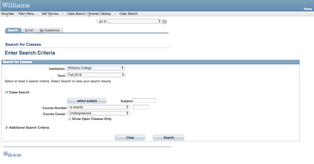
The Williams College Course Catalog available on PeopleSoft is an good example of “bad design.” When we click on the search option students are prompted to enter criteria to make the search easier. However, unless you know the exact course number, you are taken to another pop up menu where you have to select a subject. Next, you are returned to the original webpage and you have to click search again to finally take you to a list of all classes available. These extra steps make navigating through this webpage more confusing than the course catalog available on the Williams College website (let’s note that arriving to the course catalog on PeopleSoft is also confusing).

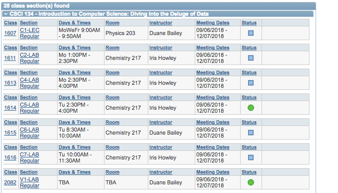
Moreover, the spacing makes it difficult to distinguish between the different courses offered. In this catalog search, classes are listed by the four digit class number followed by section, room, and instructor. Oliver Reichenstein argues that both intuition and perspective are important when deciding whether or not a design is perceived to be good or bad. It would make more sense for the instructor to be near the front of the list.
