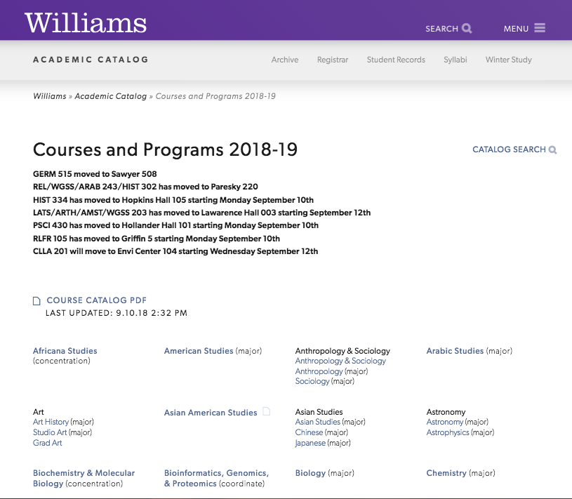
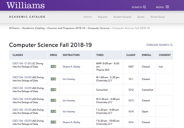
The Williams College Course Catalog is a good example of “good design.” It may not be aesthetically pleasing, but it serves its purpose. As Oliver Reichenstein mentions in his article “Learning to See,” not all designs have to be pretty in order for them to be considered good designs. A website can be aesthetically pleasing, yet hard to navigate. The course catalog is one of the easier webpages to navigate on the Williams website. Students make up the majority of the population who visit this page at the start and end of each semester when looking for courses to enroll in.
At first glance, we can see that courses are categorized based on majors, concentrations, and subjects. These categrories are also listed in alphabetical order. I would assume this webpage makes people feel good unless they find their preferred courses to be closed, but other than that this makes the process of searching courses less overwhelming. Moreover, once you’re taken to the actual list of classes available, they are ordered by class name and instructor which makes it easier to navigate.

