Overview
Designing for others is neither a simple nor quick task. It requires careful considerations and thinking outside the box. As someone who has never been a part of a design team prior to Professor Howley’s Human-Computer Interaction course, there are many concepts of user design I found useful and others that I did not. One of our main goals for this class was to incorporate technology into museums. Our group’s design revolves around making museums more accessible, specifically to people of color who often find it difficult to express their feelings about artwork due to its lack of engaging content. We experienced both positive and negative aspects I will discuss below, and from these experiences I was able to compile a list of the five key takeaways from this class that can be applied to the user design process.
Essential Aspects of the Design Process
- What is Your Scope?
- Understand Your Users
- Manage Your Time Wisely
- Use Multiple Design Methods
- Hold Yourself Accountable
What is Your Scope?
What are you trying to solve? What problems are worth considering?
I found myself asking these two questions during the initial stages of the user design process.
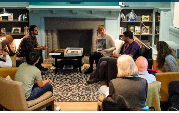
For this course specifically, at first I was interested in making museums more accessible to those with visual impairments or hearing disabilities. Where did this idea come from? Good question; after conducting a few fly-on-the-wall observations at WCMA, I noticed that this museum in particular lacked certain accommodations for other potential museum visitors. There were so many ideas running through my mind that I had to sit down and ask myself “what do I want to do”. Our individual project proposals greatly aided in narrowing my scope to making museums more accessible for people with disabilities. Once we were put into groups, we each had individual ideas, but further research about ways we can make museums more accessible allowed for our group to reach a consensus reflected in our group project proposal.
We were all interested in making museums more accessible, but accessible to whom?
Understand Your Users
At first, we did not know who our users were, besides people we might consider to be museum visitors. It took several stages into the design process to figure out who we were designing for.
Thus, once you’ve narrowed your scope to the problem you want to address, it is essential that you further narrow your focus to understanding the group of people you are designing for. Users are meant to be a resource throughout the entire design process. Understanding and knowing who you are designing for is perhaps the most crucial aspect of the design process. For this class, our task was to incorporate technology into museums. Incorporating technology to make museums more accessible is a problem my group and I were willing to design for. The next step was to talk to potential users to figure out ways to actually solve the problem.
From the two contextual inquiries and three semi-structured interviews we conducted we were not only able to narrow down our scope but also answer the question who are we designing for?
Although we were able to hone the question we wanted to answer to -> “how can we make museums more accessible for people of color?”, from this data we assumed that what people wanted was a discussion forum in which they can express their feelings and interpretations about art. We failed to think of an innovative and inclusive way of doing so, as can be seen in our initial paper prototype where we just have users input their thoughts/comments into the discussion section.
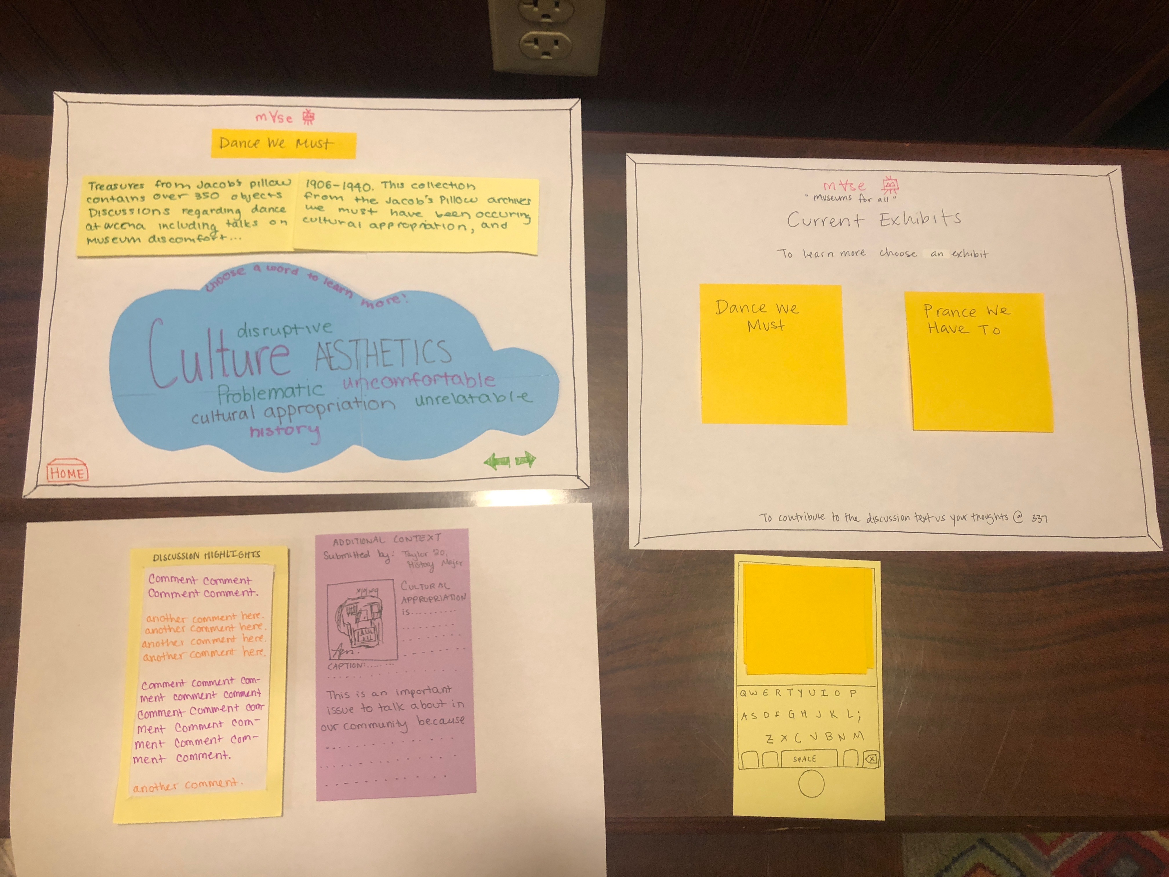
A fellow peer and Professor Howley raised the question if this would either help or further complicate the situation; “how can we be sure that those who we are designing for use this design?” Based on the mixed reviews we received from this paper prototype, we decided to redesign and conduct further research. Thus, the lesson learned was to not go with an idea a user suggests during a contextual inquiry, unless you have enough evidence to support that suggestion. One should keep in mind that what users say they want is not necessarily what they need. Unfortunately, this is a mistake our group made but we were able to refocus our attention by revisting past and new data collected.
Manage Your Time Wisely
Sometimes during the design process, time can become distorted. I was under the impression that I had more than enough time to complete tasks but deadlines can not be changed unless extensions are permissible. As an amateur it was hard for me to grasp onto the period allotted for designing, but once you know who you are designing for and what you are trying to solve, creating a list of achievable goals is a way to help you stay on track. These goals are generalized versions of your tasks. Our user design process in its most generalized form was as follows:
- Project Proposals
- Research
- Contextual Inquiries/ Interviews
- Paper Prototypes
- Evaluations/ Tests/ Feedback
- Digital Mockup
- Video Prototype
I would say that all aspects of the user design process can be time consuming if not planned carefully. The goal is to be efficient. Most of the tasks accomplished required interactions with users. Planning those ahead of time was a way our group was able to balance responsibilities and deadlines.
Use Multiple Design Methods
Along with managing your time, deciding what design methods to use throughout the design process can narrow down your focus as well. Using multiple design methods allows for data to present itself in various forms which can be easier to collect, interpret, and test.
The following lists the various techniques used throughout our design process:
Collecting Data
- Contextual Inquiries
- Semi-structured Interviews
Analyzing Data
- Affinity Diagrams
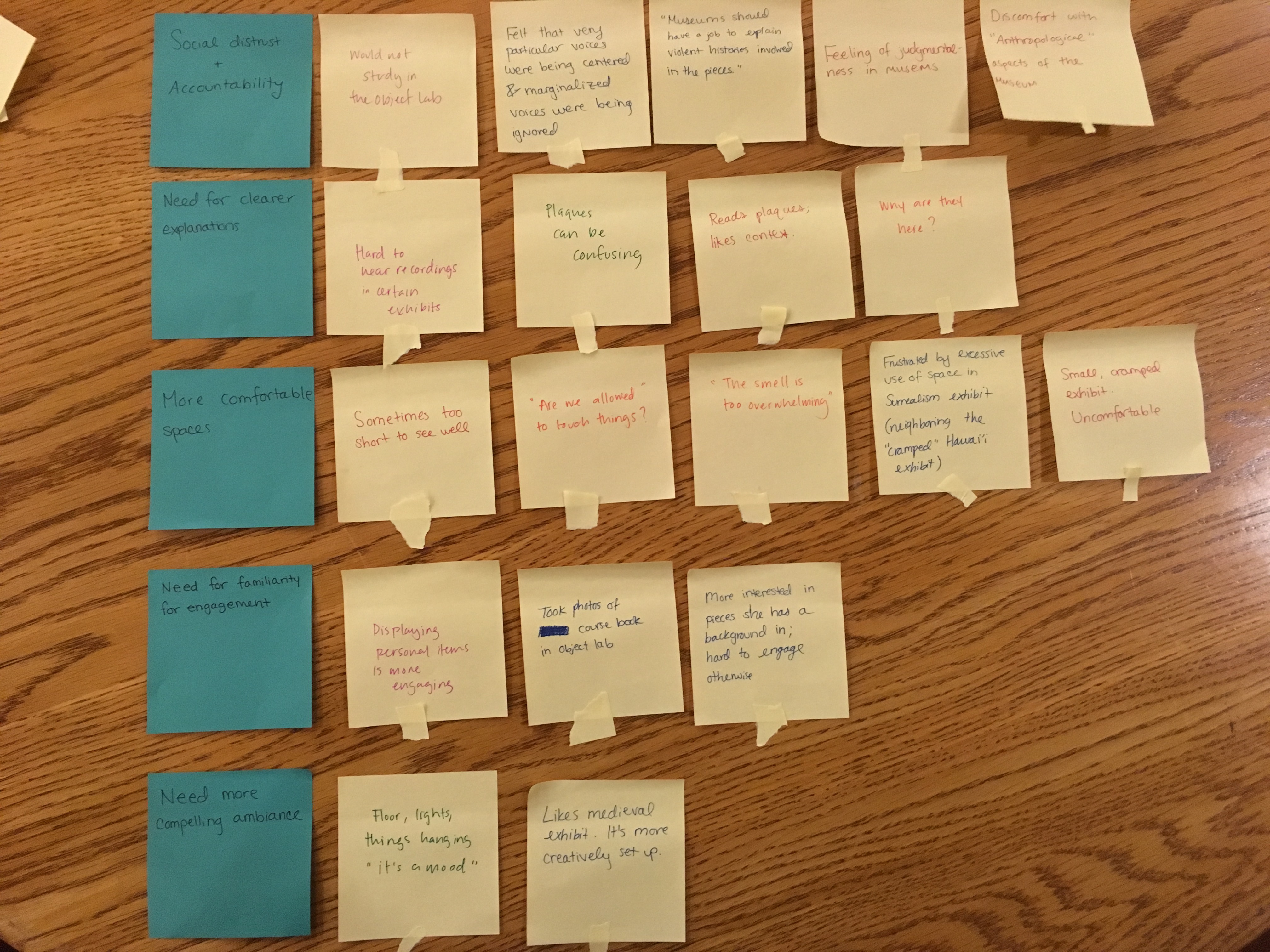
After analyzing our data we proceeded to creating task sketches that helped us create our initial paper(low-fidelity) prototype. We used the following methods to evaluate our prototype.
Testing Design
- Heuristic Evaluations
- Cognitive Walkthroughs
- Usability Testing
Our final paper prototype:
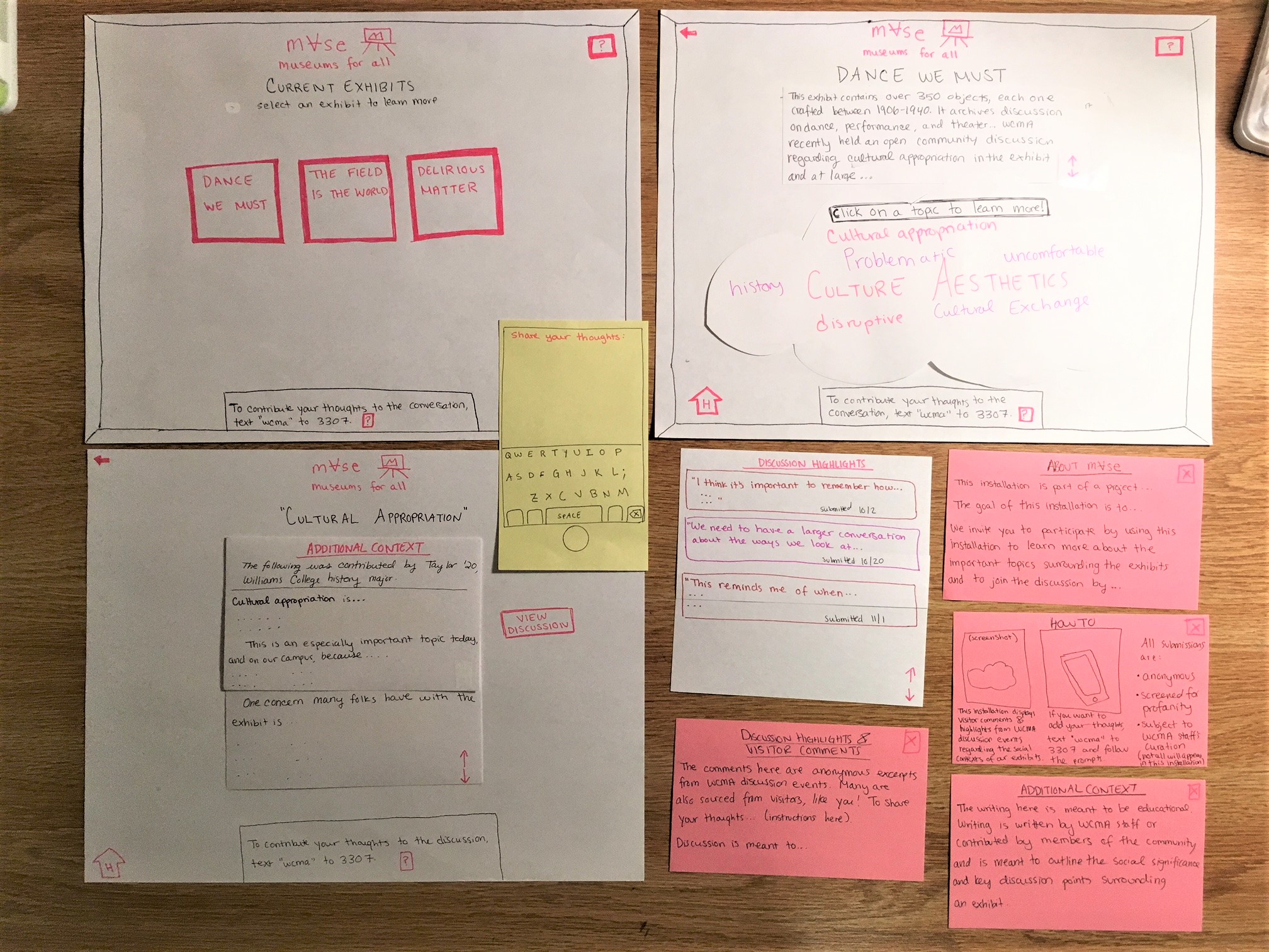
This paper prototype led to the creation of our digital mockup (high-fidelity):
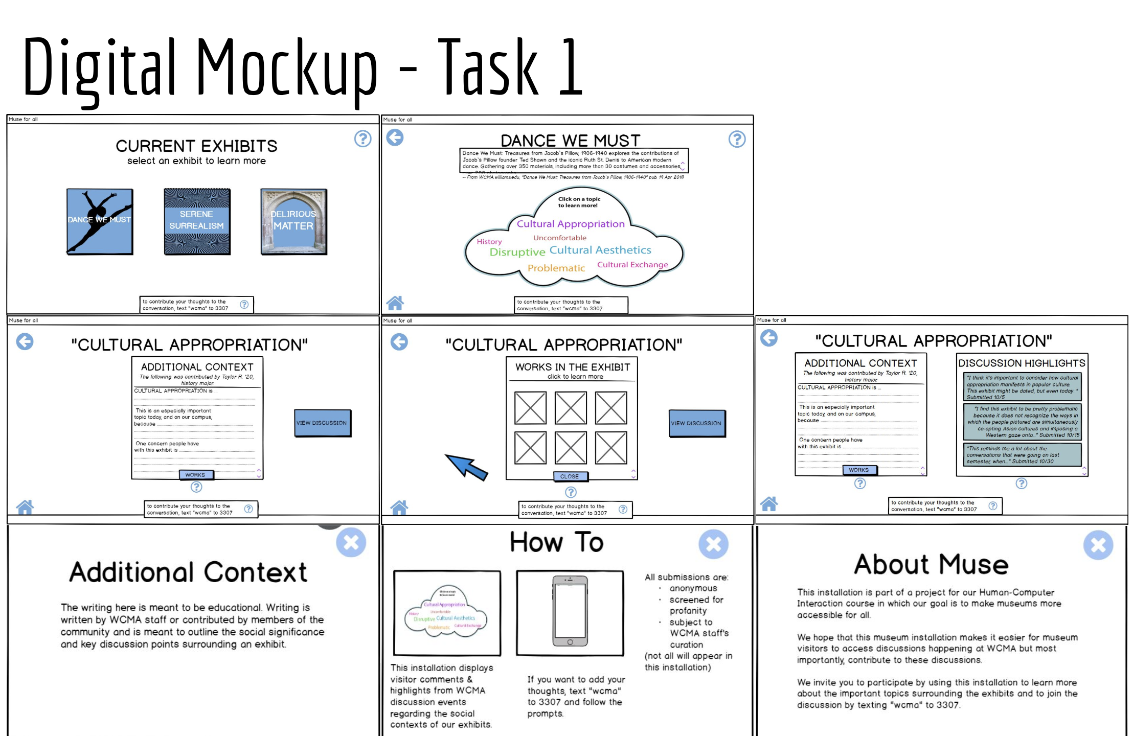
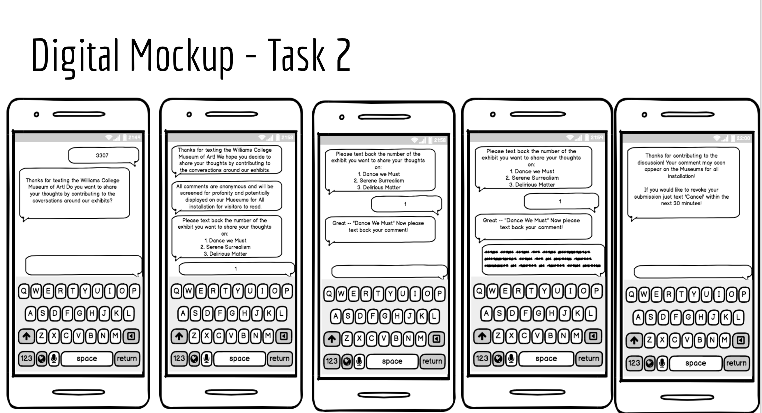
Other techniques worth considering, include but are not limited to eyetracking, customer feedback, A/B testing and card sorting. Further readings were done in class about these specific methods. Eyetracking would have been useful during the initial stages of our paper prototype. We had users think out loud during usability testing as they were completing the assigned tasks but having a more accurate trace of where users placed their eyes first would have been helpful when revising our prototype. To complement this method, A/B testing could have pointed minor revisions to be made between two versions of the same design. For immediate results, customer feedback is a quick way to get input from users about a design whether through an online form or in person conversation. Needless to stay, using 1-3 design methods per stage in the design process can help you collect and understand the data you gather and get feedback on your design in a more useful manner.
At the end, we were able to put all the puzzle pieces together to create our initial video prototype.
Hold Yourself Accountable
Once you are done with your design, in our case being the final video prototype, it is important to be aware of possible consequences that may result from your design. When these malfunctions or errors come about, hold yourself accountable. A creation is like a child, a child we don’t fully understand yet. It is one’s responsibility to care for and look after this child. I want to believe that most parents would assume the responsibility of whatever wrong or right comes out of their children. Thus, designers must do the same.
In class we discussed various ethic violations that resulted from malfunctions or byproducts of a design such as user data collection. One that left a strong impression on me was “Machine Bias…”. This article discussed the unreliability of risk assessments/scores in predicting the likelihood of a defendant committing future crimes, especially those who are non-white. Risk assessments/scores often times mislabel white defendants as low risk while black defendants get higher scores.
Though not directly related to our actual design, this ethic violation is directly related to the population we are designing for. Our design aims at raising awareness to discussions people of color may be uncomfortable being a part of. Our goal is for people to find art engaging through our installation. There is more to artwork than the visuals; the narratives discussed are a part of the experience as well.
Ethic violations should not be overlooked. If you feel that your design may result in a violation of some sort it is best to inform others of this potential harm. It is our responsibility as designers and developers to do so.
Conclusion
Overall, it is safe to say that user design and research is a worthwhile experience. From the project proposal to the final product, one can see the various stages of the design and their implications. In order to complete this process and other future design projects knowing what your scope is, understanding your users, managing your time, using multiple design methods, and holding yourself accountable for your design will greatly aid you on this journey.